5 Things You Don’t Want to Miss About Regent’s New Web Navigation
We’re putting the “great” back in navigate!
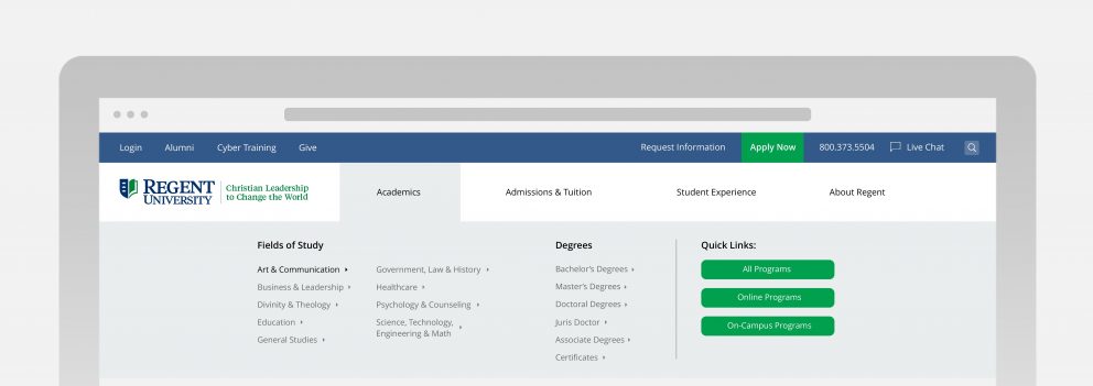
On Monday, February 12, Regent University will launch a brand-new website navigation pathway for regent.edu. This streamlined navigational system for Regent’s front-facing web pages, as well as school-specific pages, will create a linear user experience with a clear pathway to important information for students, faculty, staff and prospective students.
The new navigation was designed after careful review of regent.edu web user’s search and click habits and will include these five new features:
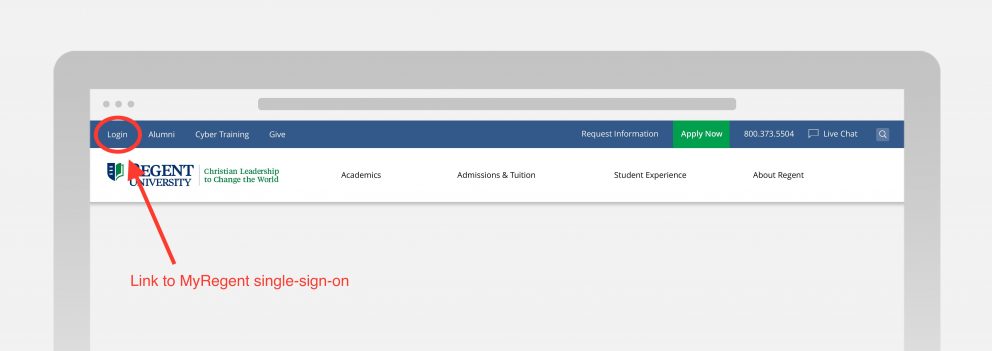
A new login for the MyRegent portal
Current students, faculty and staff will access the MyRegent portal through a single sign-in, labeled “login,” on the top left-hand side of the regent.edu home page.
Quick links to our most-searched pages
Access to popular links and our most-searched forms – Apply Now, Tuition Costs, Online Programs, Financial Aid, and About Regent – are at the ready in the search bar.
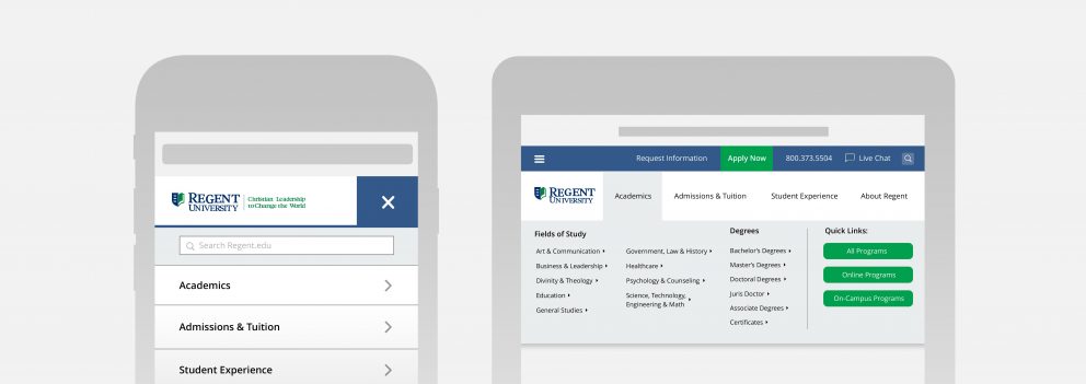
A better mobile and tablet experience
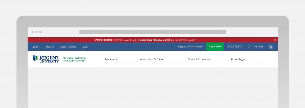
This includes an above-the-fold search function and a special RegentAlert banner for inclement weather and other important announcements (coming Spring 2018).
You’re never more than one step from home
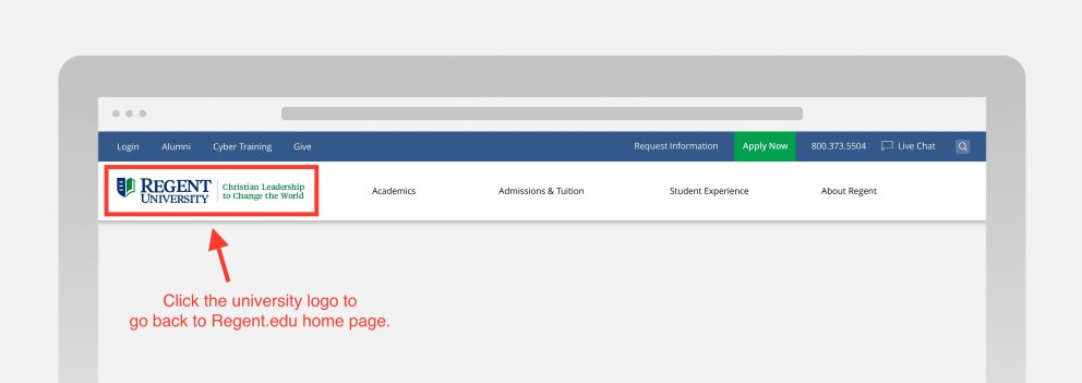
No matter where you navigate, whether on a desktop or mobile device, click on the Regent University logo to go back to the home page.
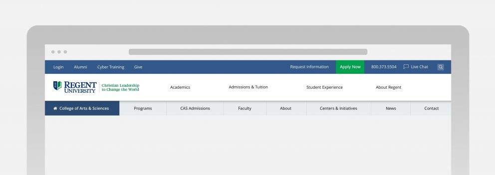
School-specific upgraded third-tier navigation
Now, school-specific pages will have links to Programs, Admissions, Centers, News and more near the top of the page.


